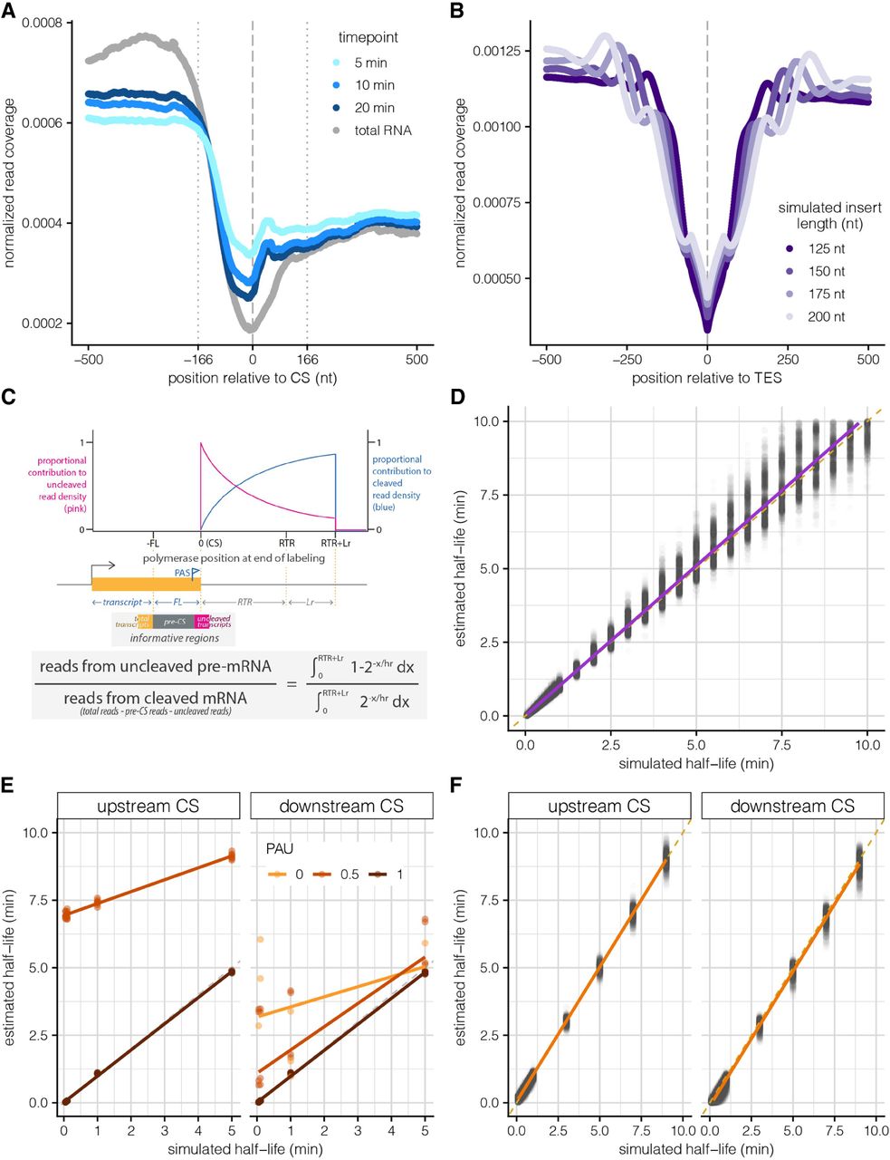
Developing a mathematical model to estimate site-specific rates of 3′ end cleavage. (A) Metagene plot showing average normalized 4sU-seq read coverage (y-axis) in a 1000 nt region centered on all annotated 3′ end CSs (x-axis), separated by 4sU labeling time points (blue lines) and steady-state total RNA data (gray line). The dashed line indicates the CS (coordinate 0), whereas dotted lines indicate the library fragment length. (B) Metagene plot showing the normalized read coverage for simulated reads (y-axis) in a 1000 nt region centered on a simulated 3′ end CS (x-axis), separated by variable simulated library insert lengths (purple lines). (C) Schematic of the expected read distribution resulting from progressive labeling with 4sU, as described in Pai et al. (2017). The probability of sampling uncleaved (pink) and cleaved (blue) transcripts is dependent on the cleavage half-life and polymerase position at the completion of the labeling period. Reads overlapping the CS can be used to approximate uncleaved transcripts, whereas reads located in a region upstream of the CS (defined by the library fragment length) are informative of the total number of transcripts and can be used to calculate the approximate number of cleaved transcripts. (D) 3′ end cleavage half-lives estimated by the mathematical model (y-axis) versus half-lives used to simulate read data (x-axis). The dotted yellow line indicates the y = x line of perfect correlation, whereas the purple line indicates linear fit to the data. (E) Cleavage half-lives estimated by the approach for constitutive CSs (y-axis) for simulated alternative CSs (panels) versus half-lives used to simulate read data (x-axis). The dotted gray line indicates the y = x line of perfect correlation, whereas colored lines indicate linear fits for sites with variable alternative usage. (F) Cleavage half-lives for alternative CSs estimated after proportionally correcting read counts by relative usage (y-axis) versus half-lives used to simulate read data (x-axis). Shown are estimates for all upstream CSs (left) and downstream CSs with a simulated PAU > 40% (right). The dotted orange line indicates the y = x line of perfect correlation, whereas the orange line indicates linear fit to the data.