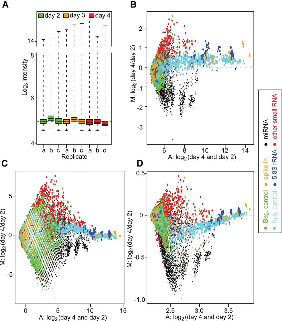
Quality control of the raw data and MA plots. (A) Box plot of the raw PM log2 intensities for the 46,227 probes on each array, shown on log2 scale. The majority of the log2 intensities are low, and the interquartile range (IQR, which is the range of the box) is very narrow. (B) MA plot of the raw PM log2 intensity data of the array c at day 4 vs. the array b at day 2. (C,D) MA plots of the PM log2 intensity after RMA + quantile + RMA (C) or normexp + cyclic loess + RMA (D) normalization for the same arrays. In the MA plot, the y-axis represents the log2 intensity ratio (M:) between the two arrays (day 4 to day 2). The x-axis represents the average log2 intensity of the two arrays (A:). The colors represent the different types of probes.